
The branding style is bold, bright and adventurous making use of unique colour combinations to differentiate AVNTR in a crowded market and appeal to its target audience.
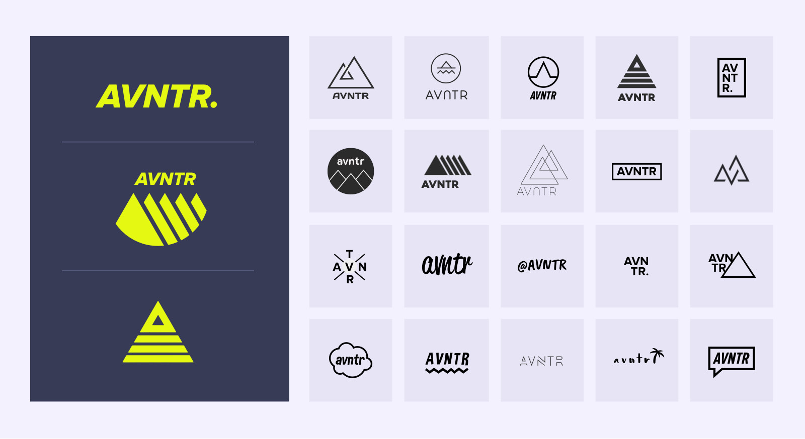
LOGO DESIGN
AVNTR is all about adventure, exploration, the great outdoors and an ever changing horizon. The logos below incorporate iconography to support this value. Coupled with using different logos in difference situations reinforces this dynamic, fluid and ever evolving environment we live in.
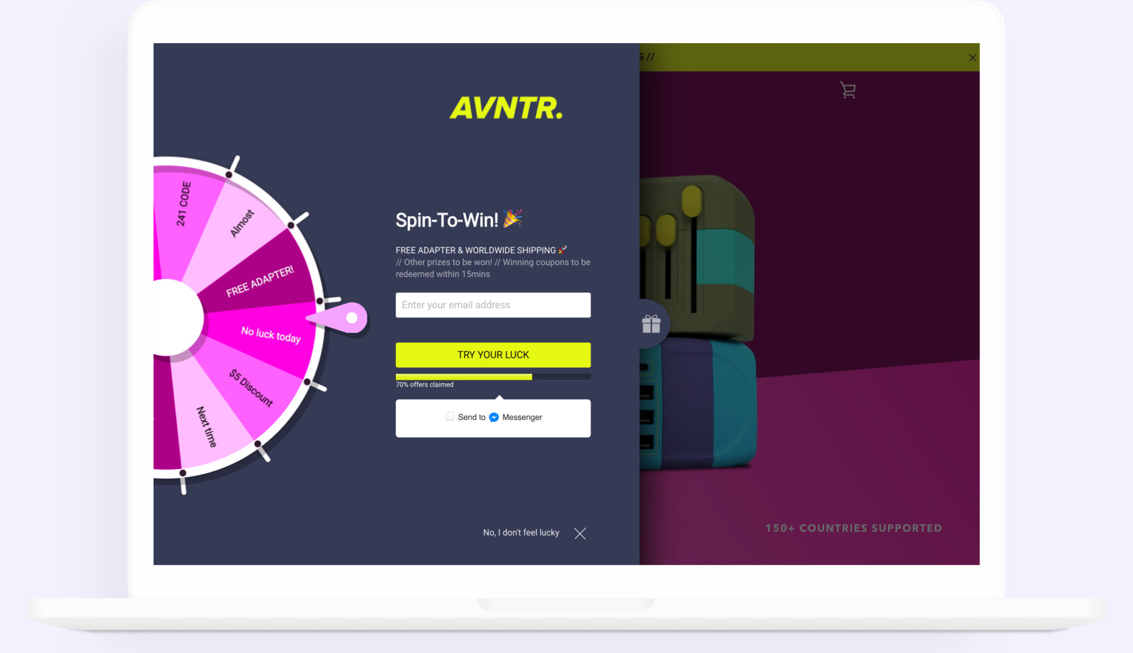
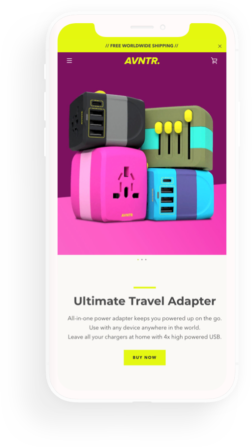
WEB STORE DESIGN
The bold AVNTR branding has been continued on the direct sale web store, AVNTR.com. It uses a number of customised plugins to increase conversion and customer satisfaction including: exit intent hooks, gamified incentives, social proof popups and personalised abandoned cart messenger sequences.
The web store is fully responsive with a strong focus on mobile. The main traffic source is social media, specifically Instagram, which has a huge skew towards mobile.
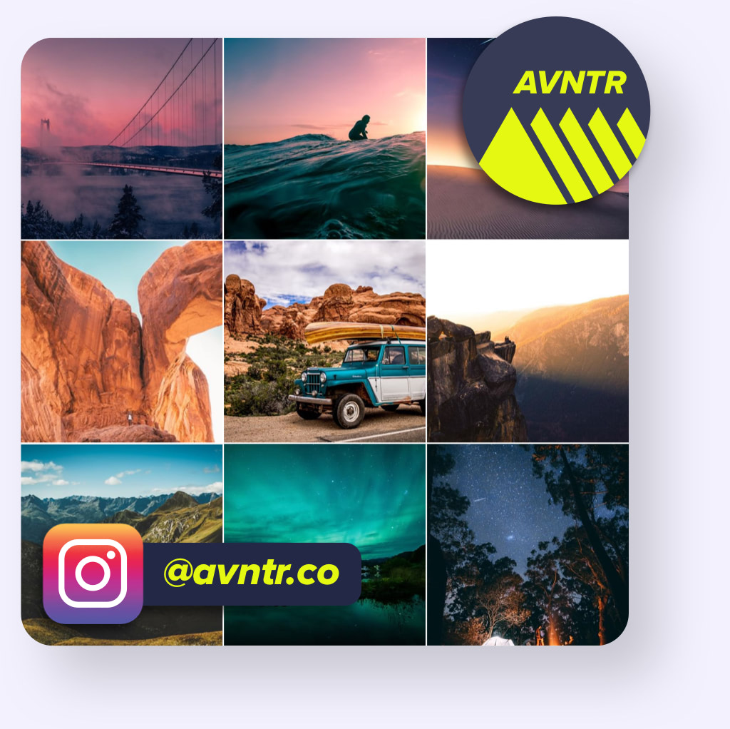
SOCIAL MEDIA
AVNTR is building a social presence focused on inspiration. Inspiration to travel, see the world, try new experiences, connect with new people and step outside of your comfort zone. Posts are free from marketing and promotion, this is done through stories and pinned story collections.
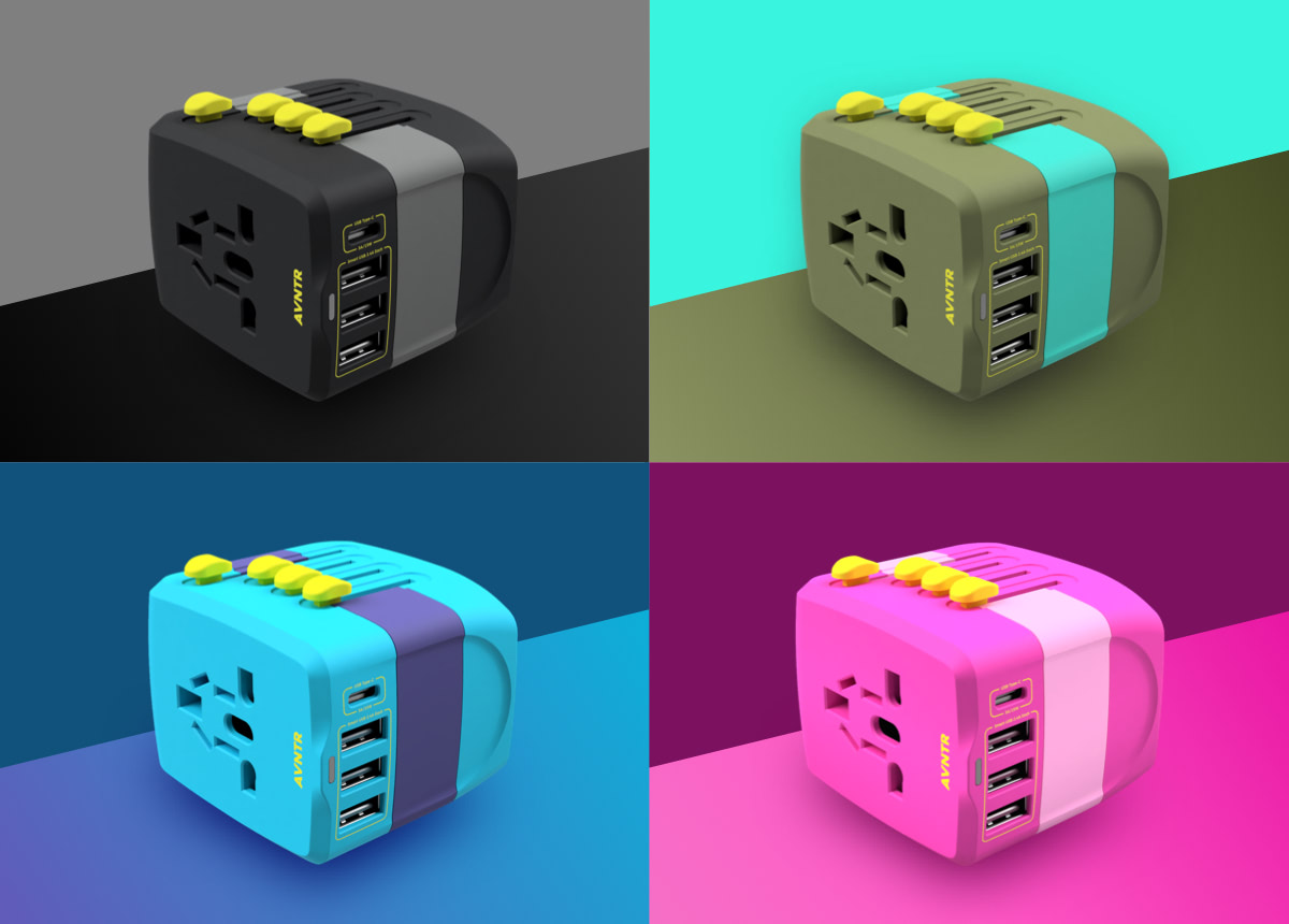
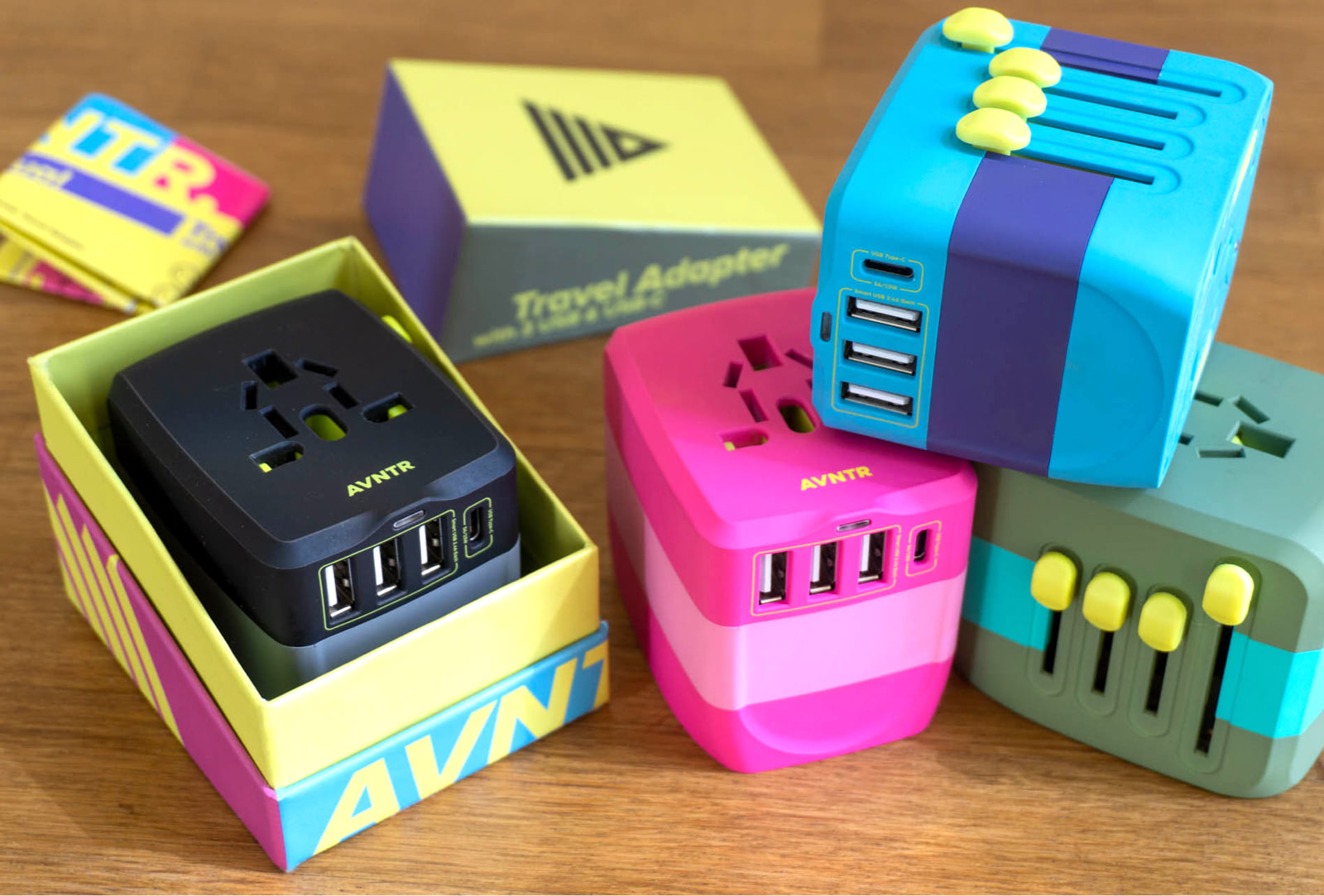
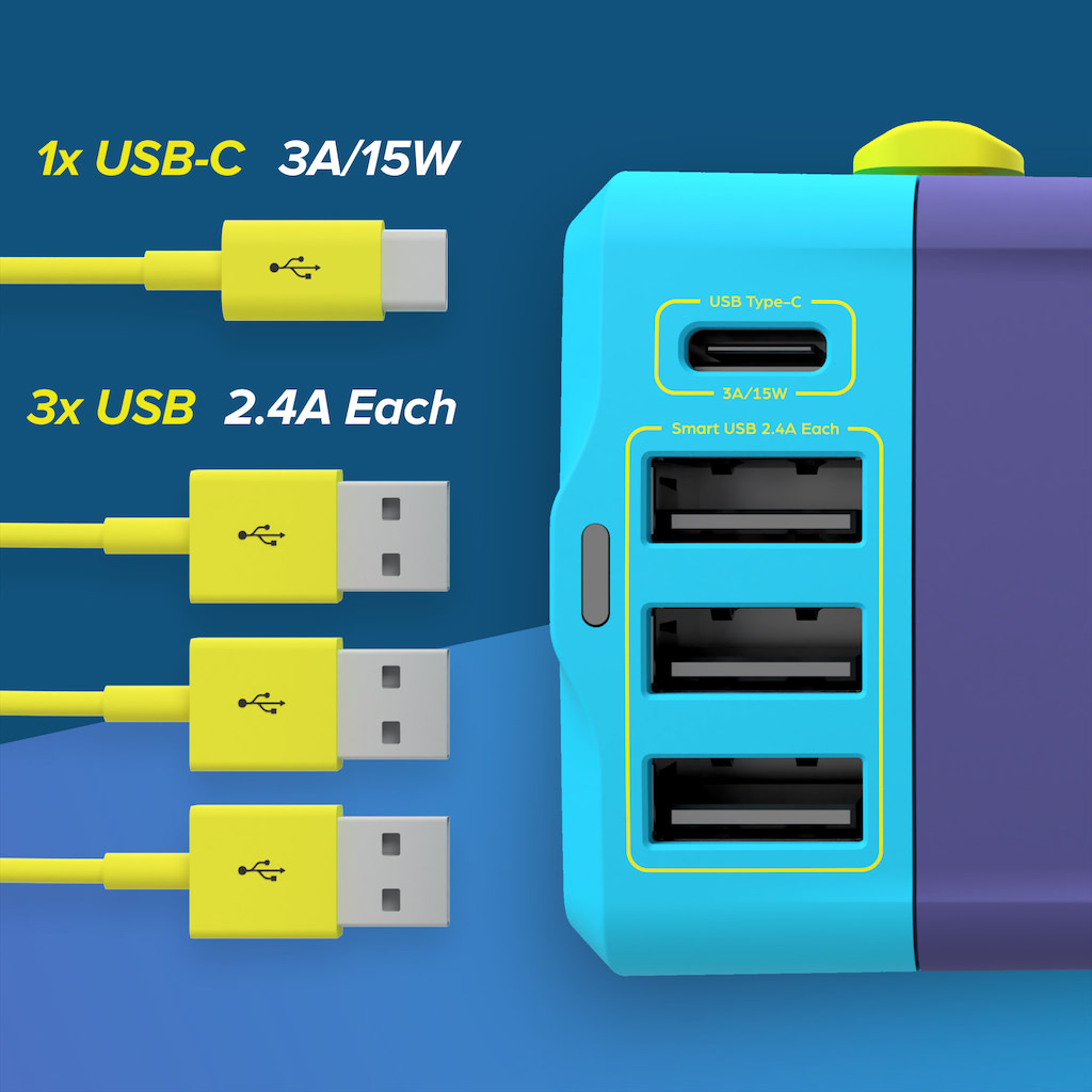
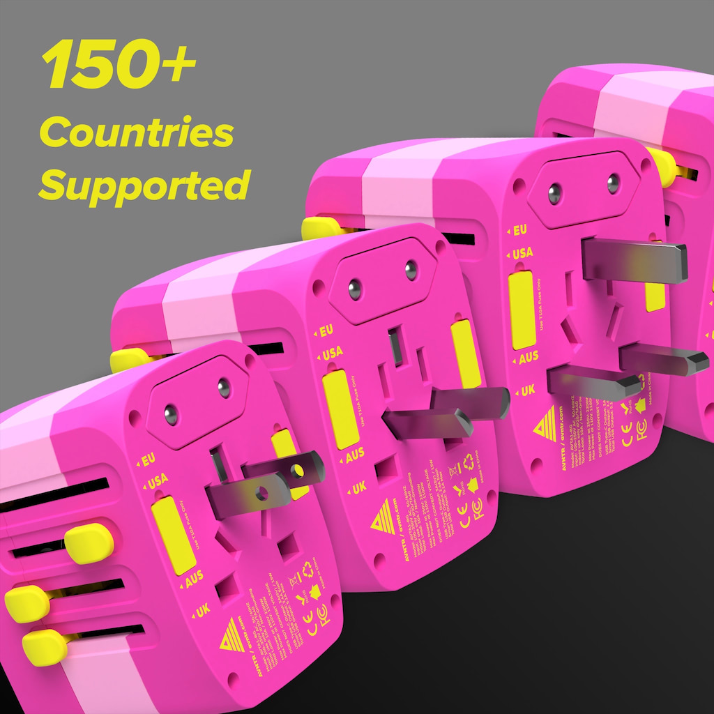
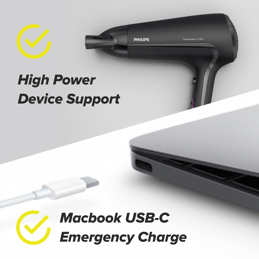
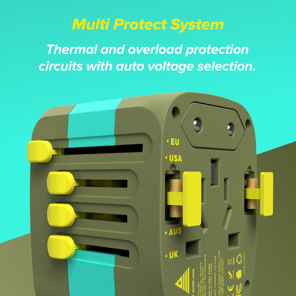
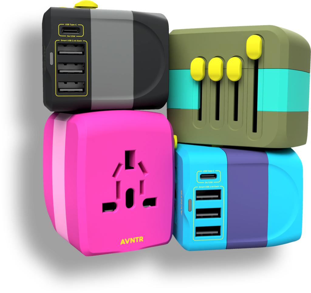
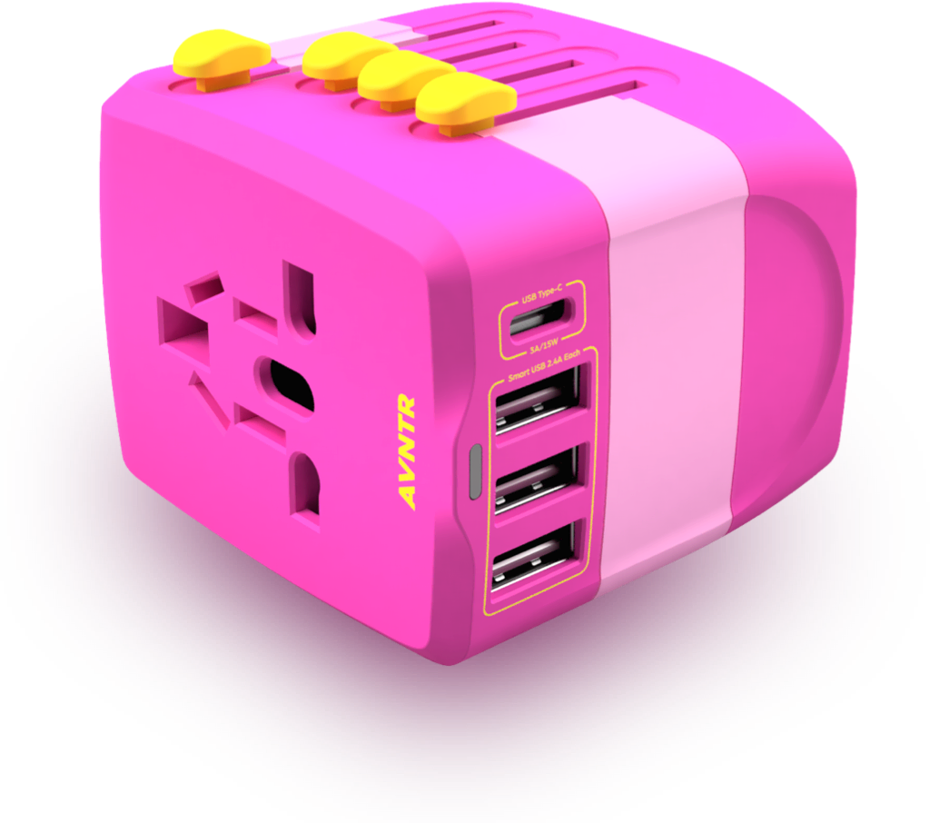
The products developed by AVNTR always incorporate the following: beautiful aesthetics, multi-use functionality and a feeling of self expression when choosing which colour is for you. Every detail is carefully considered from the materials and finished used to the design of the packaging.
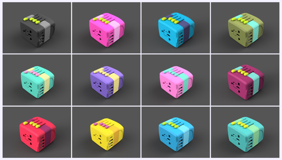
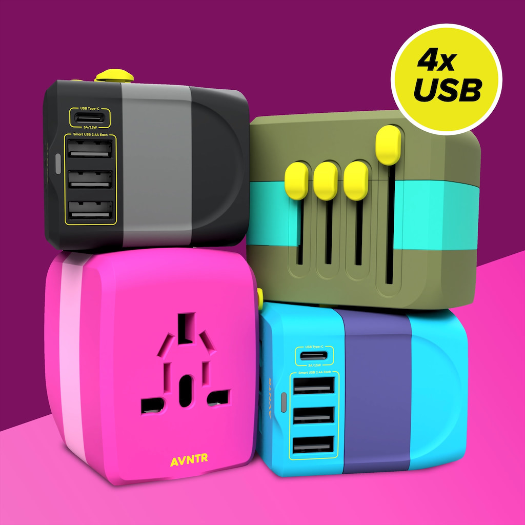
COLOUR COMBINATIONS
Vibrant eye-catching colour combinations were a key part of the design process. Congruency in style across the four launch colours was also an important consideration.